When it comes to capturing luxury, tradition, and visual impact in print design, Pantone Gold Uncoated stands out as a top contender. Whether you’re a designer working on elegant invitations, brand packaging, or product labels, understanding how Pantone handles gold—especially in uncoated formats—is essential for consistent and premium color reproduction.
In this blog post, we’ll dive deep into Pantone Gold Uncoated, compare coated and uncoated variations, and explore how to work with this regal shade across different materials and media.
What Is Pantone Gold Uncoated?
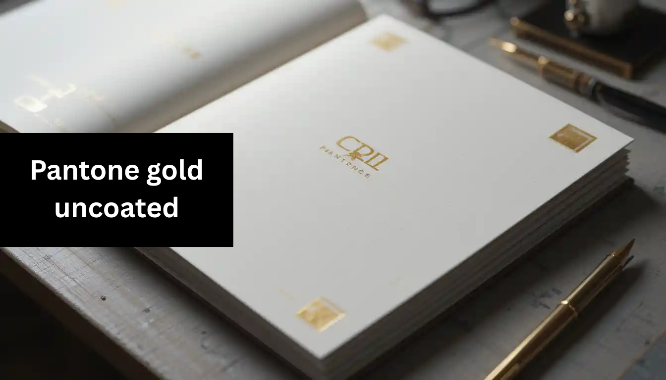
It refers to a specific shade of gold in the Pantone Solid Uncoated color library. The term “uncoated” means the color is intended to be printed on uncoated paper—think of materials like stationery paper, business cards, and eco-friendly packaging.
Unlike coated paper, uncoated stock absorbs more ink, which gives the gold a softer, more matte appearance. This finish is often preferred in minimal, organic, or vintage-themed design projects.
Why it matters: Choosing the correct Pantone finish (coated vs uncoated) ensures color consistency and brand accuracy across all print media.
Pantone Color Code for Gold: Coated vs Uncoated
One of the most common questions among designers and print buyers is: What Pantone colour is gold?
Pantone doesn’t have a single universal “gold” across all finishes. The most recognized shades include:
- Pantone 871 C – The go-to Pantone Solid Coated Gold Color Code for metallic gold.
- Pantone 871 U – The Gold Uncoated Color Code, perfect for uncoated stock.
- Pantone 10124 U or similar – Used in the Pantone Metallic Gold Uncoated range for richer, metallic effects.
Let’s break down the comparison.
| Feature | Pantone Solid Coated Gold | Pantone Gold Uncoated |
| Surface | Glossy, smooth paper | Matte, absorbent paper |
| Finish | Shiny, metallic | Flat, organic tone |
| Popular Codes | 871 C, 10123 C | 871 U, 10124 U |
| Best Use | Premium brochures, packaging | Invitations, eco-labels |
Pantone Coated vs Uncoated: Which One Should You Use?
Knowing the difference between Pantone Coated vs Uncoated is crucial when deciding which gold to use.
Coated (C)
- Has a glossy or semi-glossy surface
- Makes colors appear more vibrant and saturated
- Ideal for photography, brochures, retail packaging
Uncoated (U)
- Has a porous surface
- Colors look softer and less saturated
- Best for letterheads, envelopes, notepads, and eco-friendly prints
When to Use Pantone Metallic Gold Uncoated
For special projects where shimmer is key, Pantone Metallic Gold Uncoated offers a unique solution. While it’s hard to reproduce true metallic shine on uncoated paper, Pantone’s metallic formulas (like 10124 U) add a noticeable glint.

Best for:
- Wedding invitations
- Premium product labels
- Certificates and awards
- Limited-edition packaging
However, metallic inks behave differently on uncoated paper due to its absorbency. Always request a print proof before mass production.
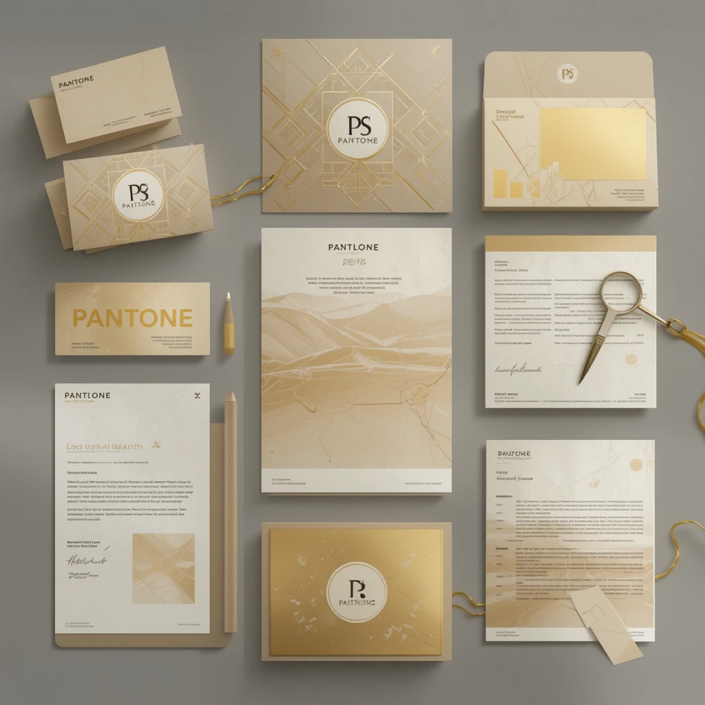
How Designers Use Pantone Gold Uncoated in Branding
Designers frequently use to communicate:
- Luxury: Soft gold feels more refined than shiny metallics.
- Sustainability: Works beautifully on recycled or natural papers.
- Timelessness: A classic gold tone never goes out of style.
Example Use Cases:
- Brand Identity: Gold paired with deep navy or charcoal creates a high-end look.
- Packaging: Organic skincare brands love the matte gold + kraft paper combo.
- Stationery: Law firms and boutique agencies use uncoated gold for a sophisticated feel.
Pantone Solid Uncoated Gold vs Solid Coated Gold: A Real-World Look
Let’s say you’re creating a luxury perfume box. You use Pantone Solid Coated Gold (871 C) on the exterior for shine and Pantone Gold Uncoated (871 U) on the internal card insert. The visual difference is subtle but meaningful—the coated version gleams under light, while the uncoated version offers a soft matte contrast.
This strategy showcases your attention to detail and elevates the user experience.
How to Choose the Right Pantone Color Book
If you’re working with Pantone colors regularly, investing in the right color guide is non-negotiable.
Here are some Pantone color books to consider:
- Pantone Formula Guide Coated & Uncoated
– Ideal for graphic and brand designers. Includes all Pantone spot colors in both coated and uncoated formats. - Pantone Metallics Guide
– Essential if you’re working with metallic shades like Pantone Metallic Gold Uncoated. - Pantone Bridge Guide
– Shows how Pantone spot colors look when printed in CMYK.
Looking for deals? Many designers look up the Pantone Color Book Price in Bangladesh or India for affordable options from international resellers.
Pantone Color of the Year 2022: A Stylish Download for Reference
While not directly related to gold, many creatives search for Pantone Color of the Year 2022 Download as part of their trend analysis.
In 2022, Pantone’s color of the year was Very Peri (Pantone 17-3938)—a dynamic periwinkle blue with violet-red undertones.
Pairing Very Peri with Pantone Gold creates a striking balance between vibrancy and warmth, ideal for fashion or lifestyle branding.
Pantone Gold Uncoated Color Scheme Ideas
Need inspiration? Here are some tasteful Pantone Gold Color Scheme combinations:
- Gold + Charcoal Gray + White
– Classic, clean, and sophisticated - Gold + Forest Green + Cream
– Nature-inspired and elegant - Gold + Blush Pink + Taupe
– Romantic and soft, perfect for weddings - Gold + Navy Blue + Ivory
– Luxurious and timeless for upscale branding
Use these schemes in your mood boards or client proposals to showcase visual harmony.
Tools for Working with Pantone Colors Digitally
While Pantone colors are created for print, here are tools to help you match them digitally:
- Pantone Connect (Plugin + App): Access color codes, harmonies, and libraries inside Adobe tools.
- Coolors.co: Useful for building color palettes that include Pantone swatches.
- Adobe Color Wheel: Try combining gold with complementary colors.
Keep in mind, Pantone Color Code values (like 871 U) are meant for print precision—not exact screen display. Use them for physical production specs, not RGB previews.
Printing Tips for Pantone Gold Uncoated
Here are a few expert tips for success with Pantone Gold Uncoated:
- Ask for Test Prints: Always test gold tones on your final uncoated stock.
- Mind the Finish: Metallic uncoated inks won’t be shiny, but will look elegant.
- Use Spot Colors: Don’t convert gold Pantone to CMYK unless necessary—it won’t look the same.
FAQ
What is Pantone Gold Uncoated used for?
This is typically used for printing on matte or absorbent papers like stationery, business cards, and eco-friendly packaging, where a softer, non-reflective gold finish is desired.
Is there a metallic version of Pantone Gold for uncoated paper?
Yes, Pantone offers metallic ink options for uncoated papers, such as Pantone 10124 U, which adds a subtle shimmer without the gloss of coated finishes.
How does Pantone Solid Coated Gold differ from Uncoated Gold?
Pantone Solid Coated Gold appears more vibrant and shiny due to the glossy paper, while it looks softer and more muted on absorbent paper.
Can I use Pantone Gold Uncoated in digital designs?
Pantone colors are primarily intended for print, but you can reference in digital designs using approximate RGB or HEX values. Just be aware that the digital version may not match the printed result.
What type of printing works best with Pantone Gold Uncoated?
Spot color printing is ideal for this, as it ensures the most accurate color reproduction, especially on high-quality uncoated stock.
Is Pantone Gold Uncoated suitable for eco-friendly brands?
Yes, its matte finish and compatibility with natural papers make it a favorite among sustainable and eco-conscious brands.
Where can I find the Gold Uncoated color code?
You can find the color code in the Pantone Formula Guide for Uncoated colors. A common example is Pantone 871 U.
Why does gold look different on coated and uncoated paper?
Uncoated paper absorbs more ink, dulling the appearance of colors. Coated paper reflects more light, making gold appear glossier and more metallic.
Can I convert Pantone Gold Uncoated to CMYK?
You can simulate it using CMYK, but it won’t capture the same richness. For exact matching, stick to Pantone spot color printing.
Is Pantone Gold included in all Pantone books?
Not all. You’ll find it in Pantone Formula Guides that include uncoated swatches, and sometimes in metallic or specialty editions depending on the version.
Final Thoughts:
Pantone Gold Uncoated gives designers and brands a refined, understated way to express luxury without the glare of metallic shine. It’s perfect for eco-conscious packaging, premium stationery, and timeless branding projects.
With the right planning, palette, and production approach, this subtle gold can become the hero of your print story.
You May Also Like :